Project Overview
A small goat farm in Washington state wanted to create a professional brand aesthetic that reflects their dedication to responsible breeding while keeping to their family farm roots. In the goat husbandry world, websites are often clunky, difficult to navigate, and reminiscent of early html websites. Okay to navigate if you’re an experienced goat farmer; impossible for a beginner or hobbyist. Although not a part of the goat business, the farm owner is also involved in the equestrian world, which has a more elegant look at the high-end competitive levels. Thus we married the two together: the polished aesthetic of the horse world meets the website needs of a small goat farm.
My Contribution
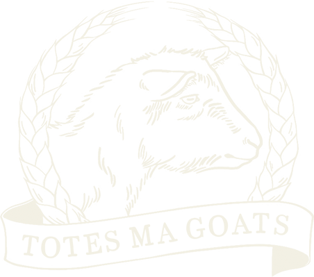
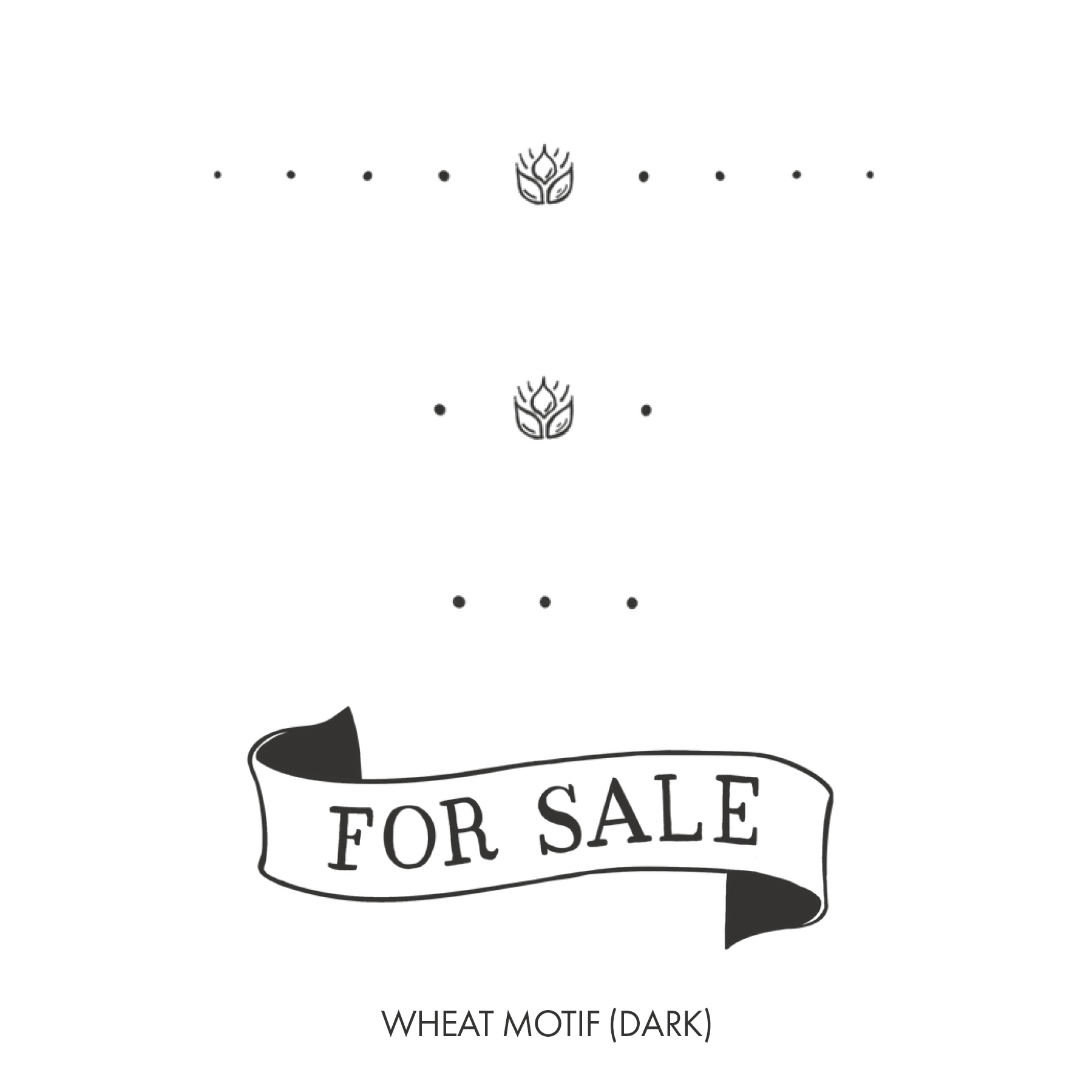
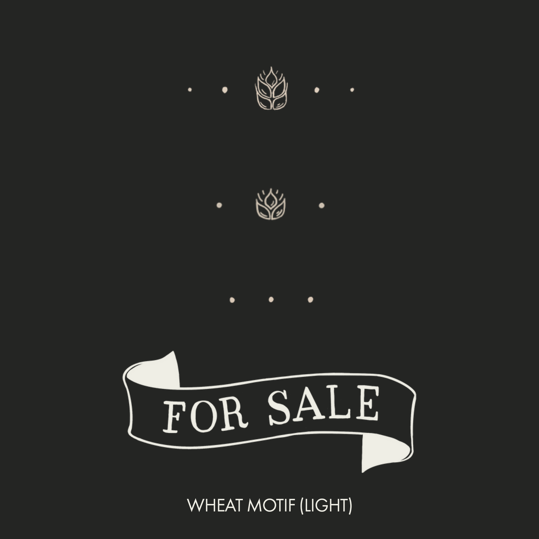
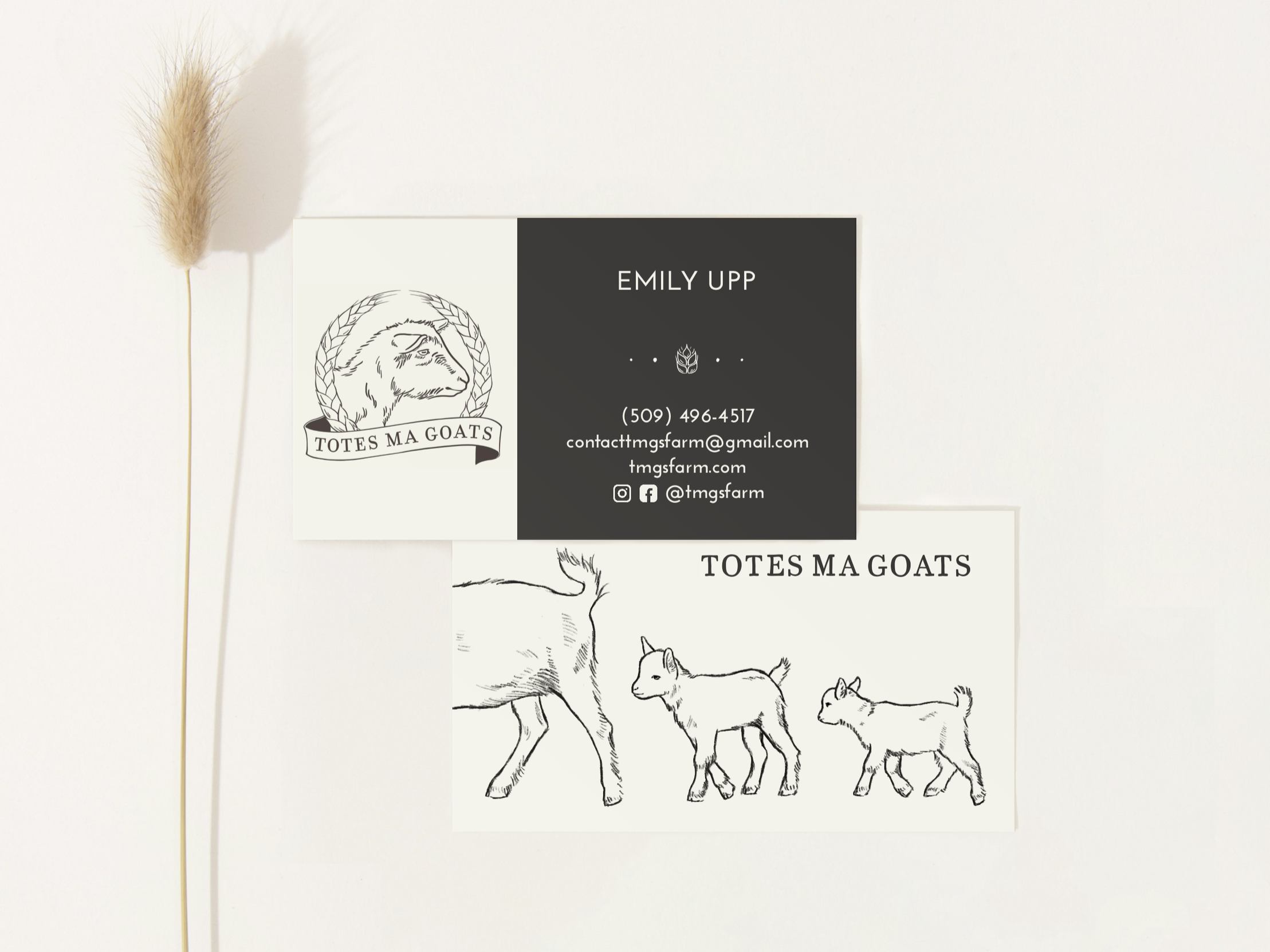
I first approached about a logo design. The client wanted to lean into an old farm aesthetic. Because this farm specializes in one goat breed - Nigerian dwarf goats - I wanted to clearly show this by having a close crop of one of their goat’s profiles, which I framed with wheat and the banner. When it came to the brand manual, I wanted to expand upon this illustrations style while pairing it with high-end equestrian aesthetics. I used an old type font face, wheat motifs and a color palette reflective of nature by having green paired with neutrals pulled directly from the goats’ colors. From there I created their business cards and website with a brand consistently and professional look so potential buyers feel confident that they’re working with a reputable farmer who gives careful consideration to goat genetics and compositions.
Coat Colors
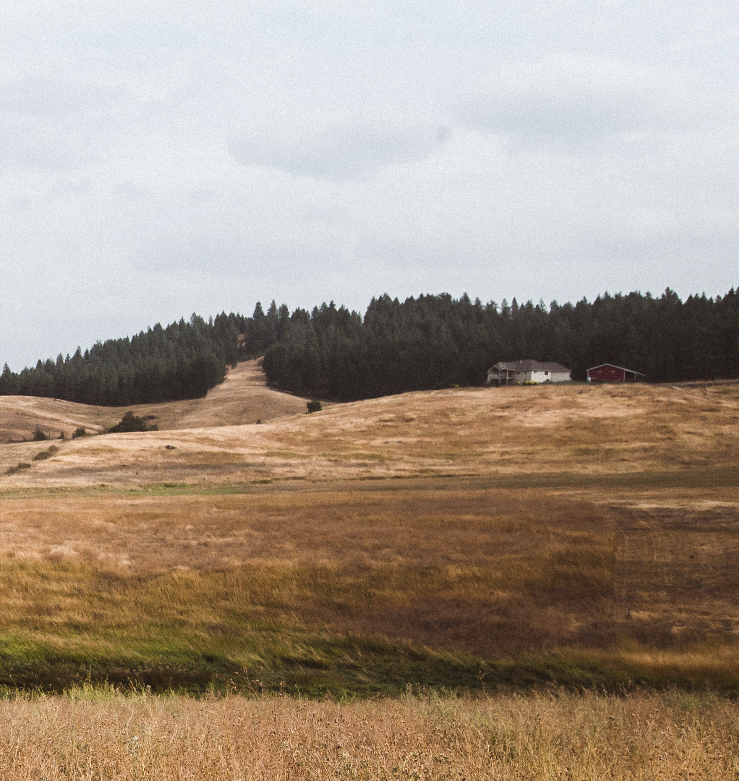
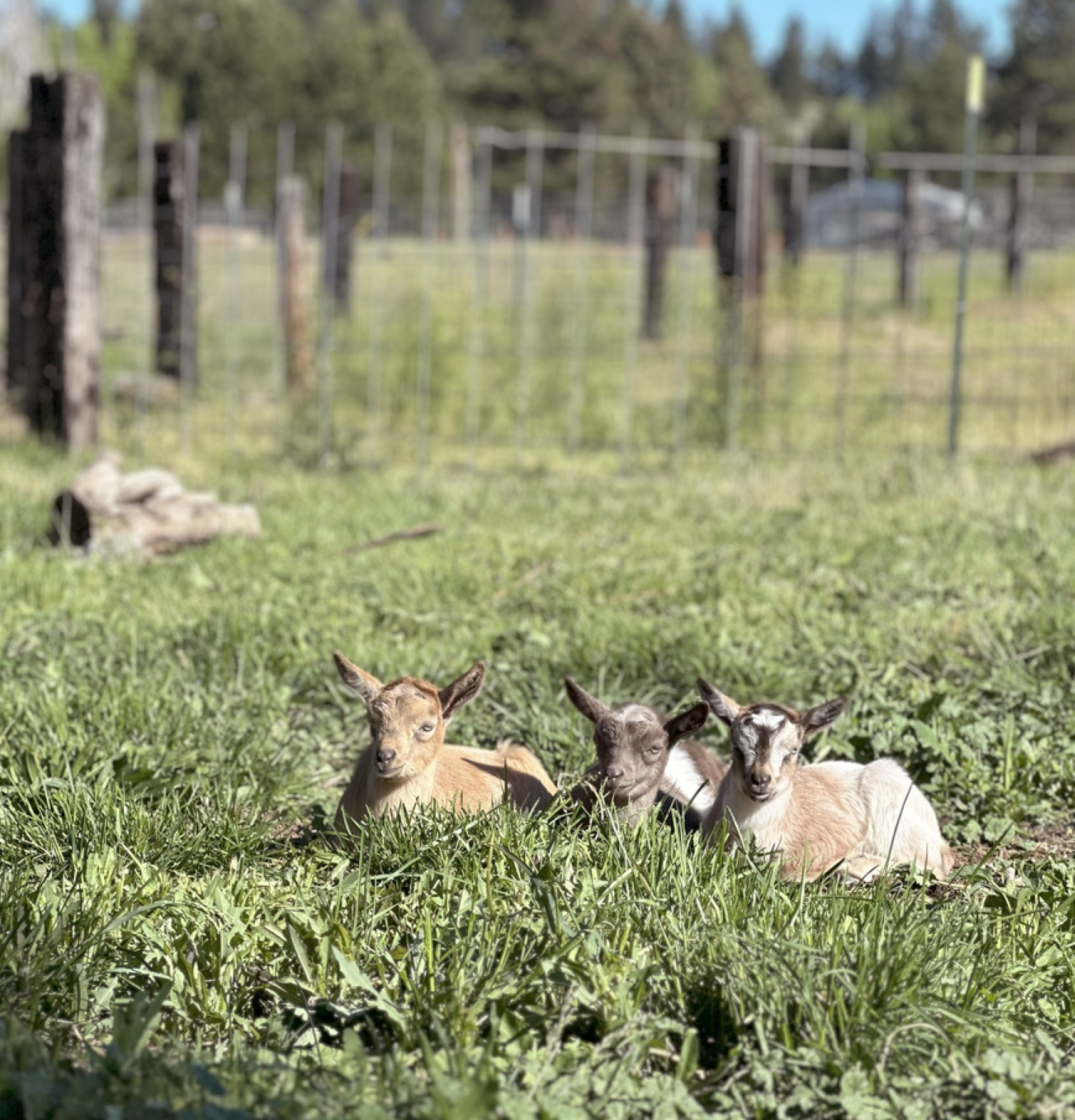
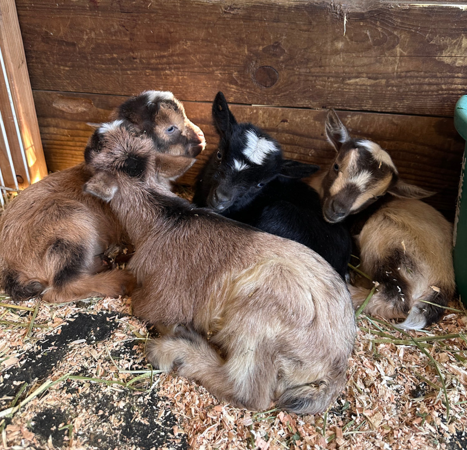
I wanted the colors to reflect the heart of this farm - the goats. So I pulled directly from their coats and the eastern Washington hills, where the farm is located.
It’s The
Little Things
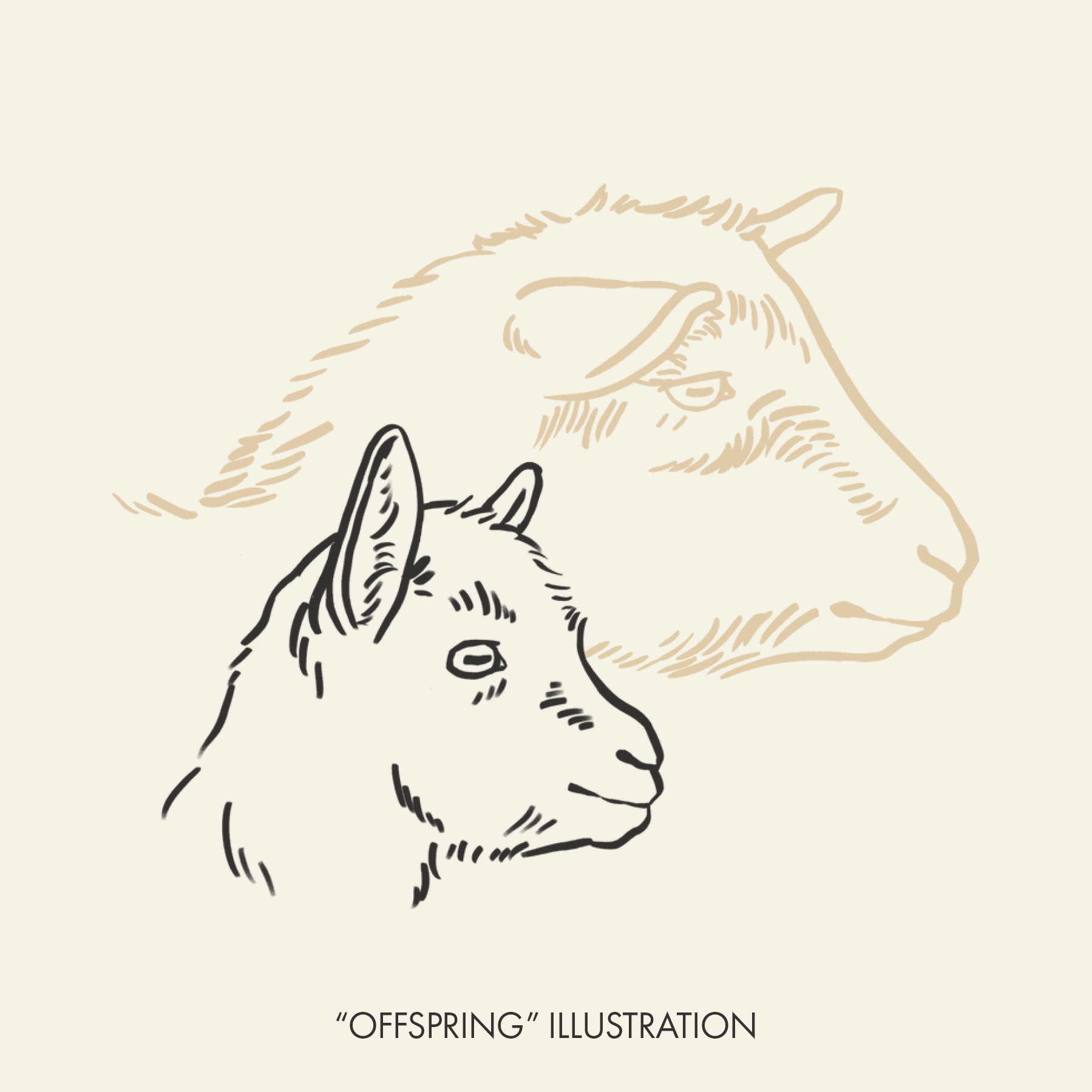
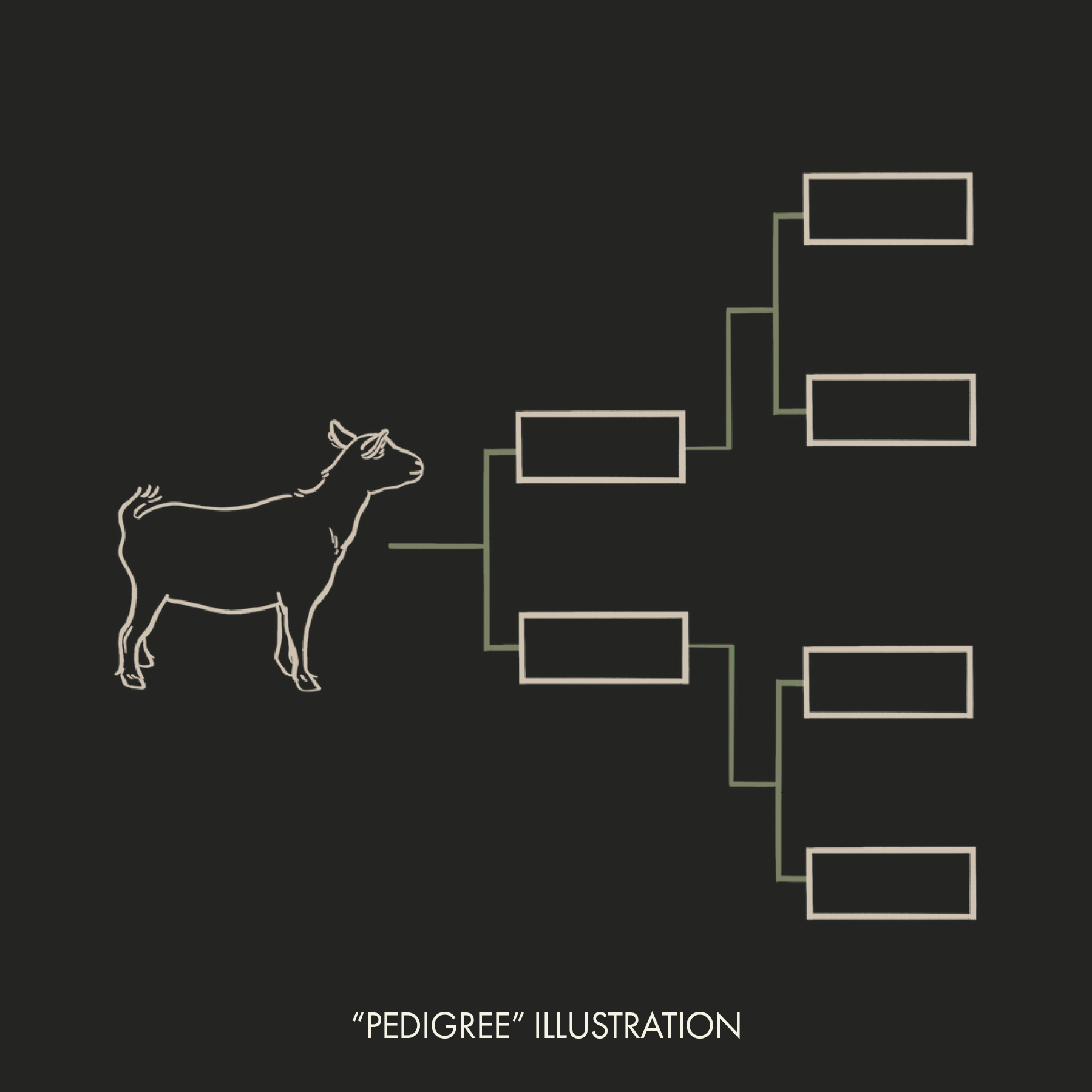
I believe small details set you apart. It shows an attention to detail and care that reflects who you are as a business owner. There’s a lot of information a responsible breeder should provide about their livestock, so adding images can help break up and organize large amounts of text.
Digital Meets Physical
I wanted a consistent look between the business cards and website, and part of that was using a wheat motif and woodcut inspired illustrations. The goat images are modeled after their actual goats, highlighting the pride in their livestock.
Brand Guidelines (pdf download)


